Overview
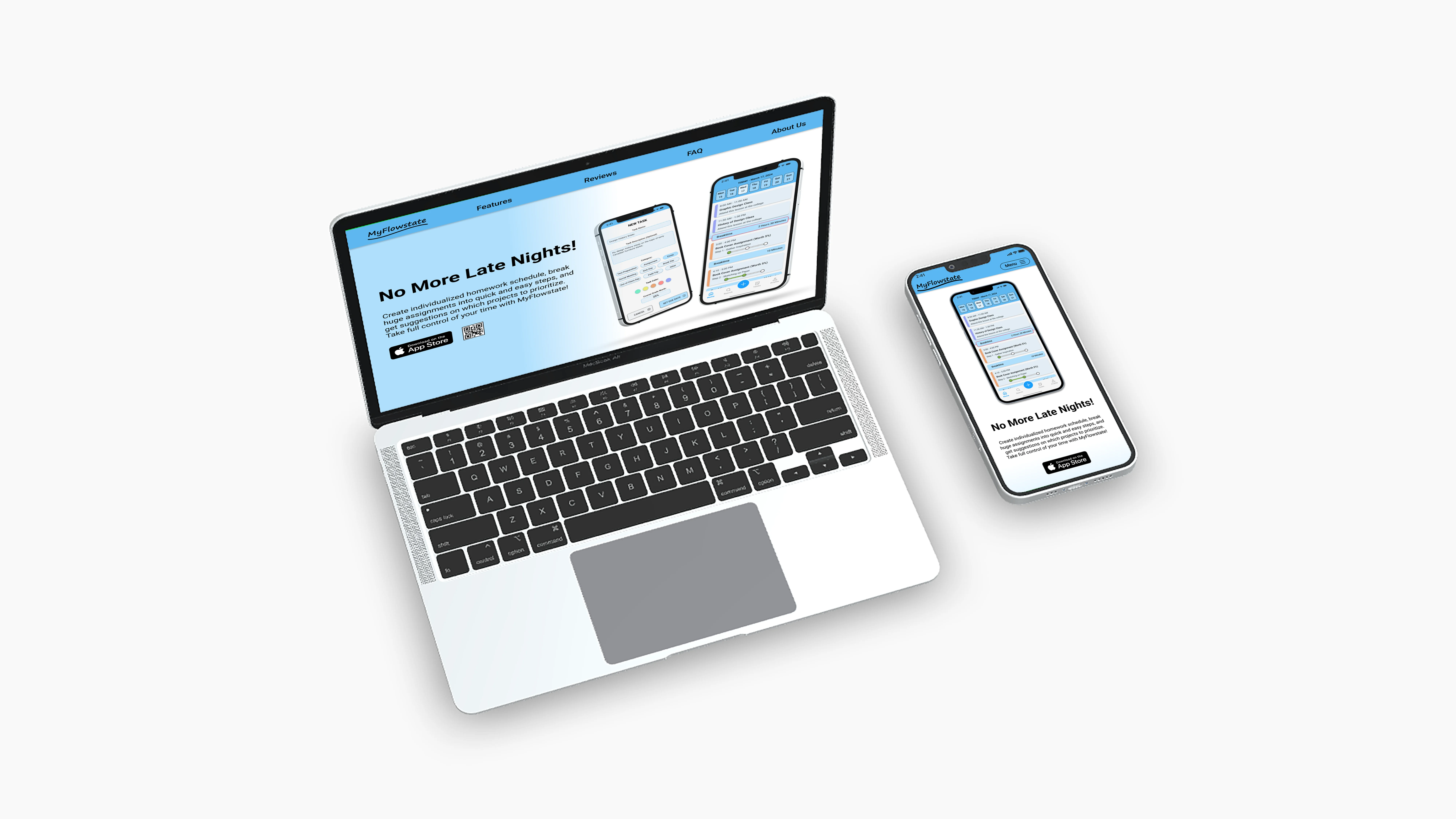
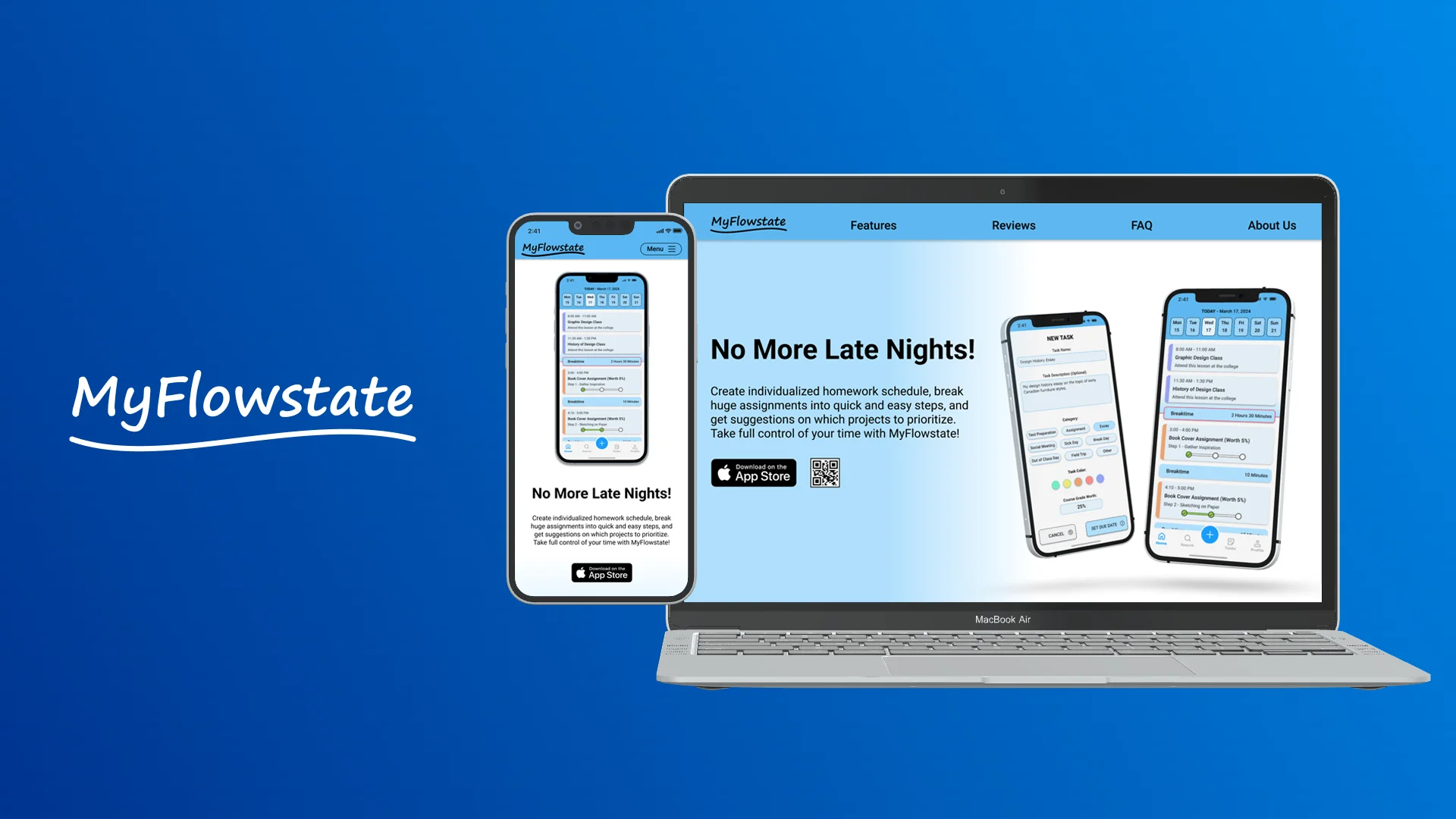
In Canada alone, there is over 2 million students who are enrolled in post-secondary education. Which creates a huge demand for phone apps that assist students with time management and scheduling. This marketing website is built to advertise MyFlowstate app to college and university students by showcasing its features and advantages, and why they may want to choose it over any other time management app on the market.
The Problem
There are hundreds of competing time-management applications, with some of them built specifically for students. Which makes it very difficult for any app to stand out without an online presence. MyFlowstate needs a marketing website that can effectively advertise the app to students by showcasing its functions and unique features.
How might we effectively market MyFlowstate app to post-secondary students so that more of them can find out about it and learn that it can fulfill their specific needs?
The Solution
The marketing website for MyFlowstate is tailored to appeal to the demographic of college and university students. Coming in a classic one-page format, the website not only introduces the app to the audience but also emphasizes its unique features and gives a comparison on how it prevails over the competition.
A Set of Requirements
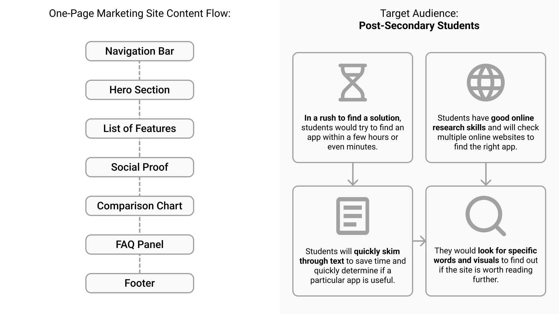
This project had a rigid set of requirements in regards to what content had to be included on the site. This marketing site had to promote the app and showcase its functions in an effective way. I also had to keep in mind that the target audience of this website are post-secondary students, young adults who are likely to be in a rush and would skim through the site instead of reading it fully.
Target User Group
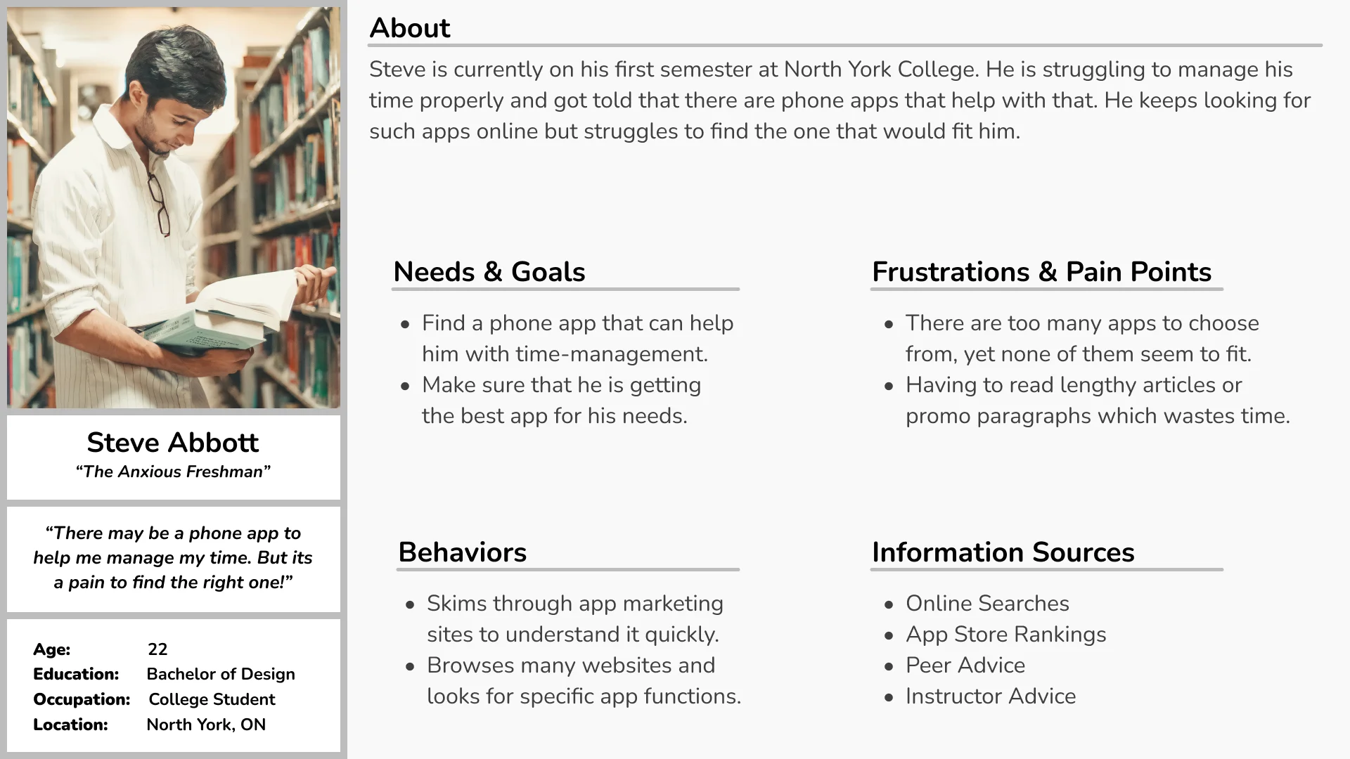
The target audience for MyFlowstate app first has to find out about the app online. Having already performed primary and secondary research into this user group from developing the app earlier, I had a good understanding of their goals, frustrations and behaviours, writing a persona which represents their needs in regards to a marketing website. The website should convince the target audience that MyFlowstate is the best choice.
Visual Design Inspiration
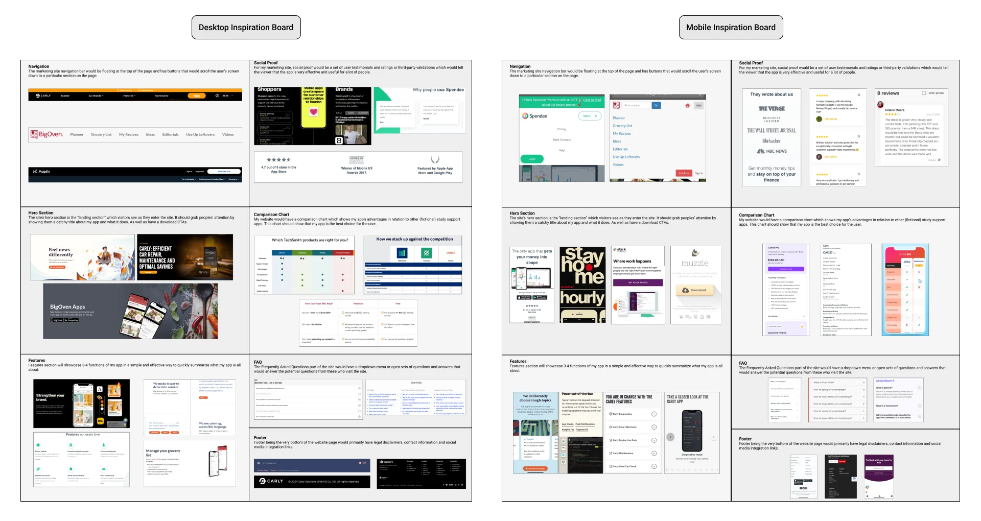
There are hundreds of time-management apps on the market, which makes it a very competitive field for a new product to break into, I had to make sure that this website has an effective visual design and can clearly communicate the app's value to the audience. Thus, I gathered visual inspiration from other successful app marketing websites to better understand how successful sites are structured, and learn from their designs.
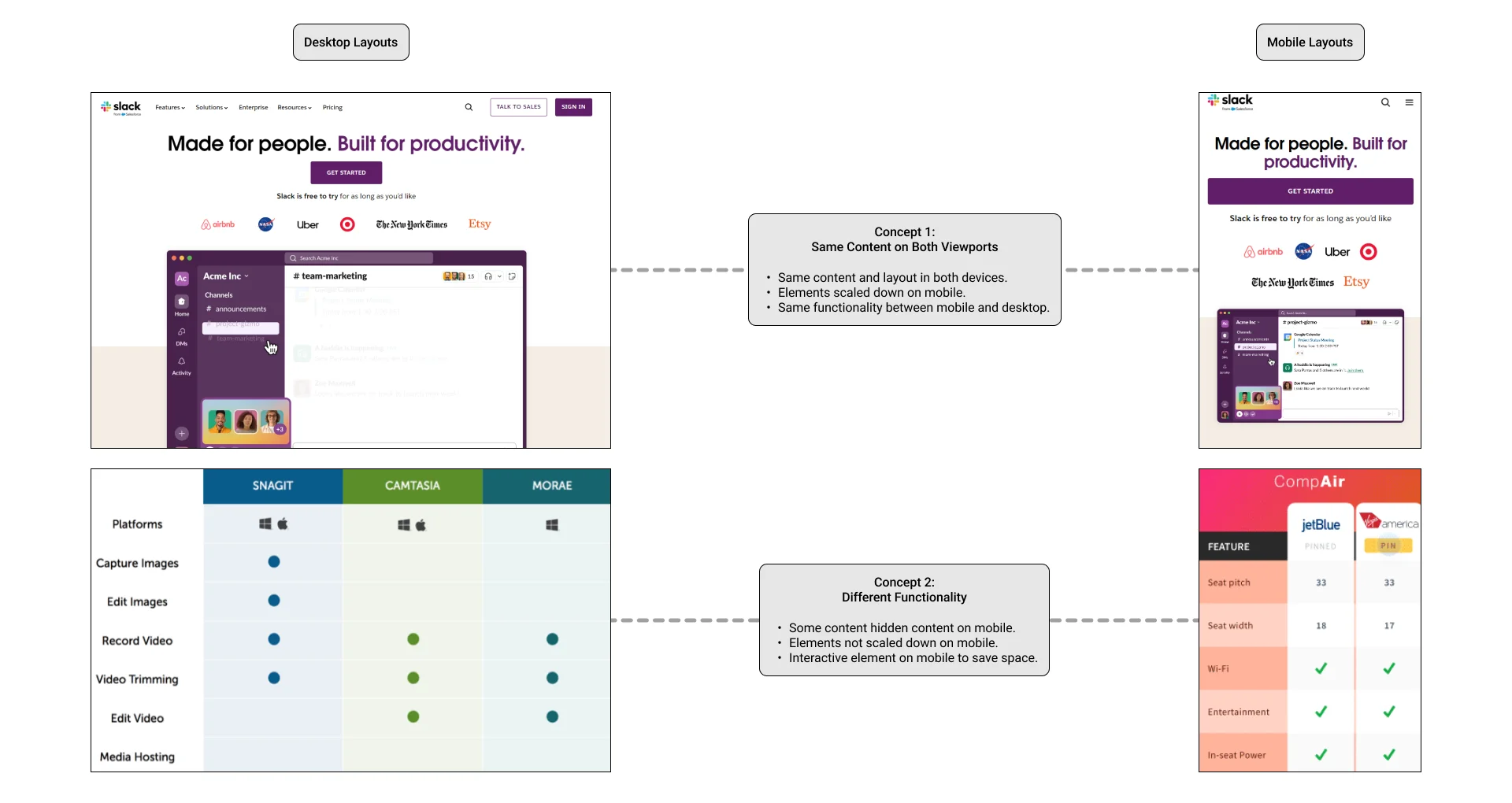
Since I was designing a responsive website for both desktop and mobile, I also wanted to see how other websites handle the layout changes between widescreen desktop and small mobile screens. While desktops allow for larger amount of information to be shown, such as very elaborate hero sections, phone screens allow greater degree of interactivity between the user and the website.
Sketches & Wireframes
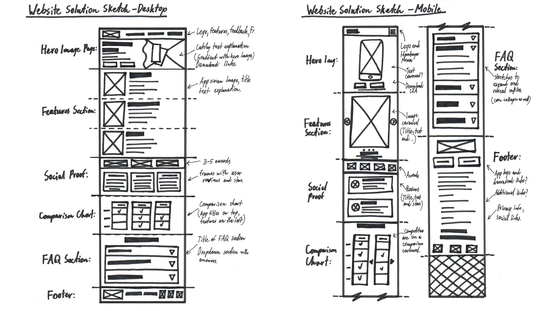
After gathering visual inspiration and noting how certain visuals and elements can be interactive to save space on mobile version of the website, I created layout sketches for both desktop and mobile version. Taking the Desktop First principle because students are more likely to visit this website on desktop computers, being used to doing homework and conducting research on desktop computers rather than mobile devices.
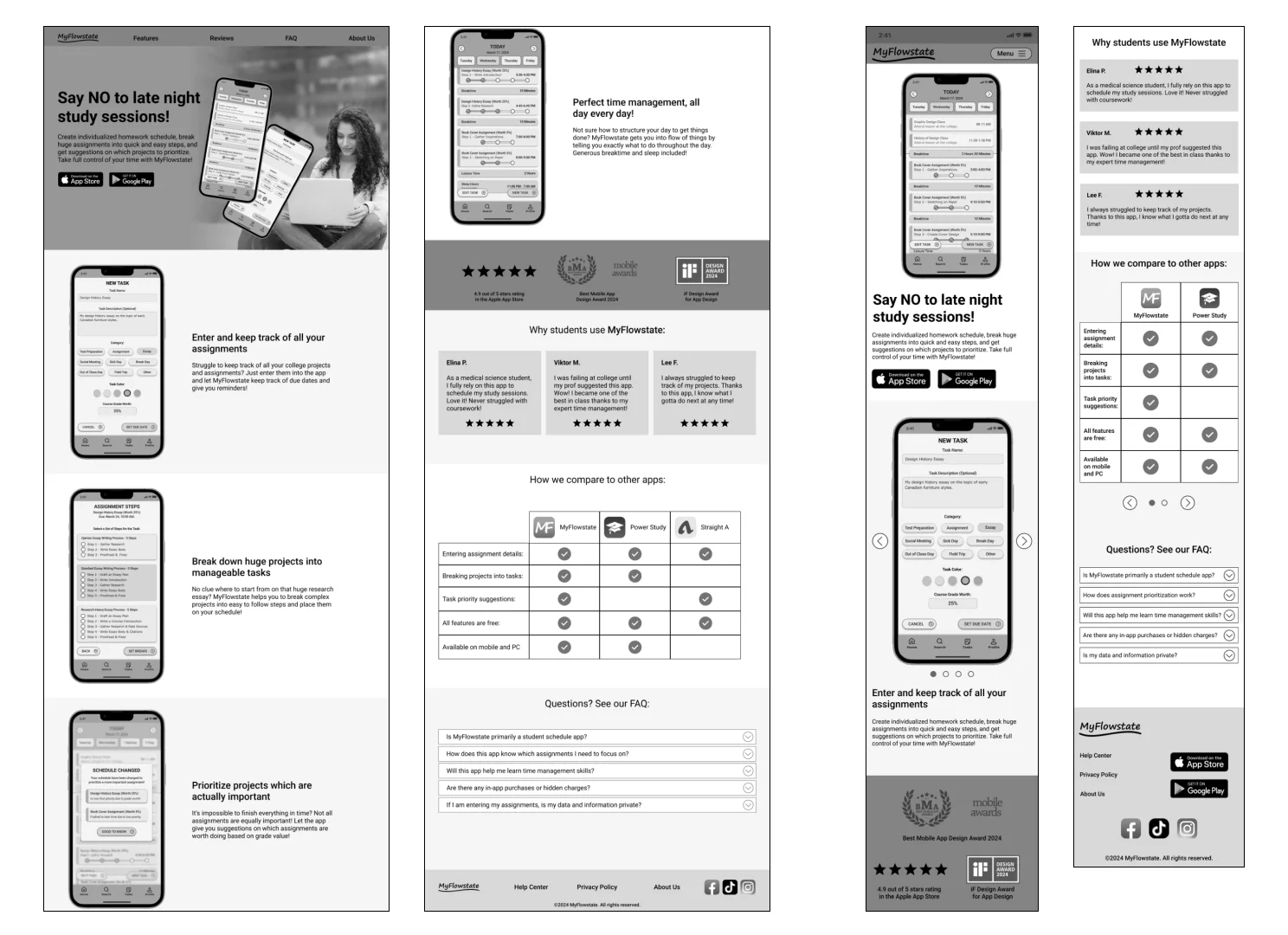
While building wireframes, I took the time to include all the content right away to make sure that the visual layout does its job in showcasing the app's features in an effective and clear way. Notably, carousels on mobile version of the site allowed the page to be much easier to scroll through.
A/B Testing & Improvements
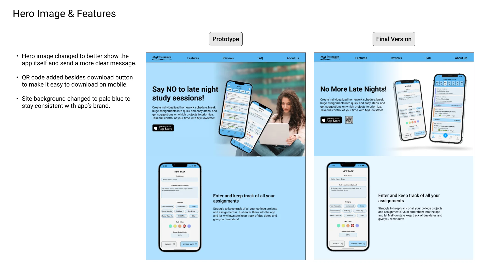
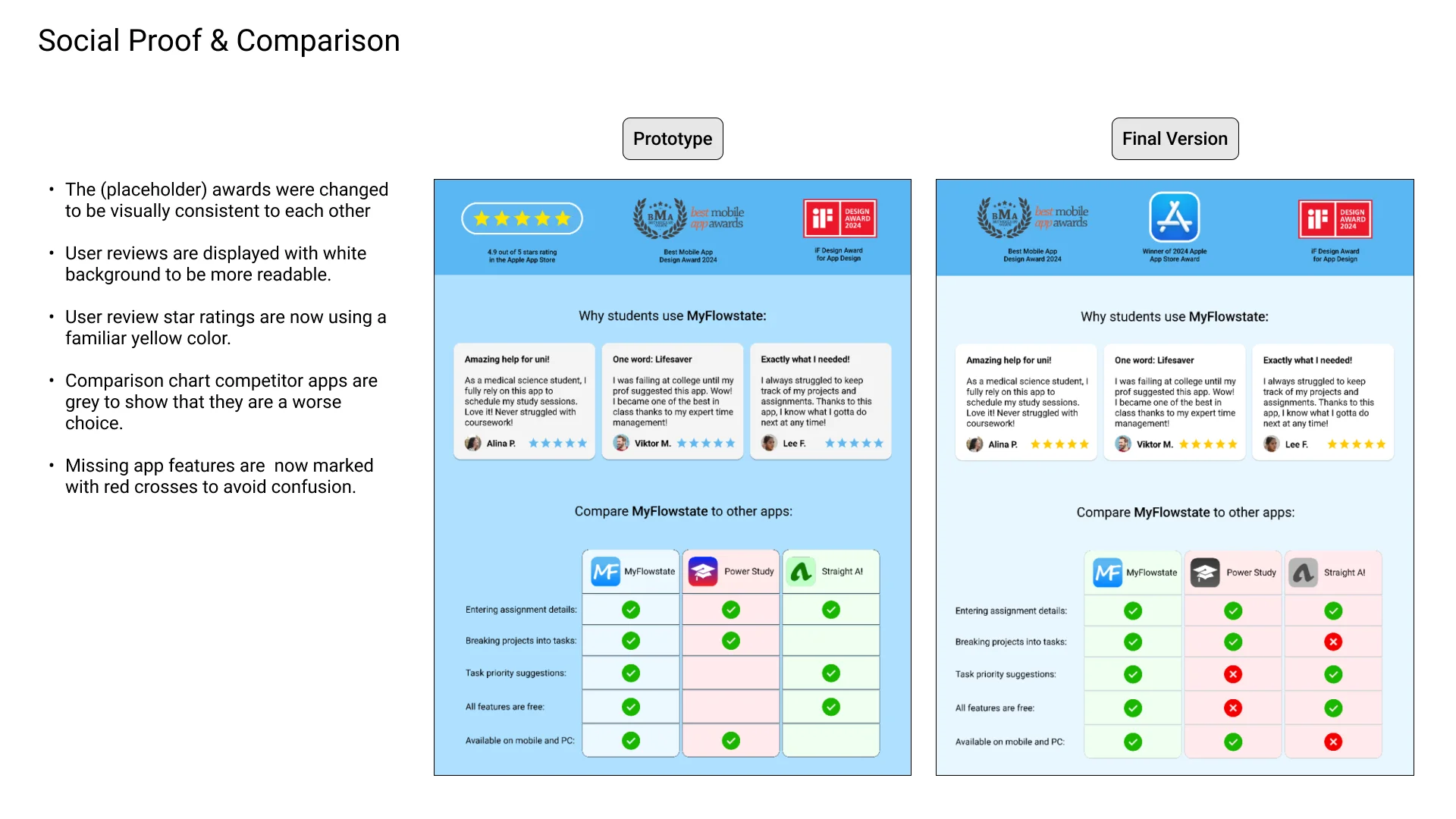
After building website prototypes, I conducted a round of A/B testing with potential users. Users were asked to go through 2 versions of desktop and mobile prototypes which had different visual layouts, and say which version they believe is more effective at convincing them to download the app. Based on their feedback, I made a few improvements and changes to the design to make it more visually impactful and usable.
Final Solution
Through analyzing the needs of target audience, designing, prototyping the website and improving it after an A/B testing session, it was time to finalize it. This responsive marketing website promotes MyFlowstate app to potential users by showcasing its features and comparing it to competitor products. Effectively communicating the app's premise and value within a single page and gives an easy way to download it.
A One-Page Marketing Website
Interactive Mobile Version
Clear Comparison Chart for Both Viewports
Takeaways
Always take outside factors into account while designing websites for specific use cases. Sometimes a simple website with just enough content to get the point across is much better than an elaborate site with fancy features. Especially if the target users tend to skim through content quickly rather than read everything in detail.

